First things first, I am doing this post on four companies: World Wildlife Funds (WWF), Burger King (BK), Apple, and the World Trade Center (WTC). The two whose signs and logos clearly portray the companies meaning to me are WWF and BK while Apple's and WTC's logos both confused me on why they were made the way they were.
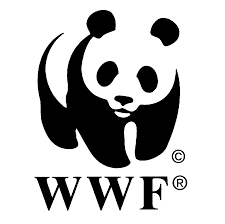
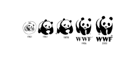
For those of you who have no idea about WWF, their logo is a panda. As for what the company is doing is quite simple, they raise money and awareness of endangered species across the world. Why this logo wasn't, say, a Bengal Tiger or African Elephant? It is because of a certain panda named Chi-Chi who was kept in a zoo in London back in 1961, the year this organization was founded. This symbol was chosen so people across the world of different languages and cultures would understand their company's message. Since the beginning the logo has changed and seemingly grown from a cub to an adult. This panda will most likely remain to be a symbol of the conservation movement and the logo for this company of WWF.
- References -
http://www.worldwildlife.org/species/giant-panda
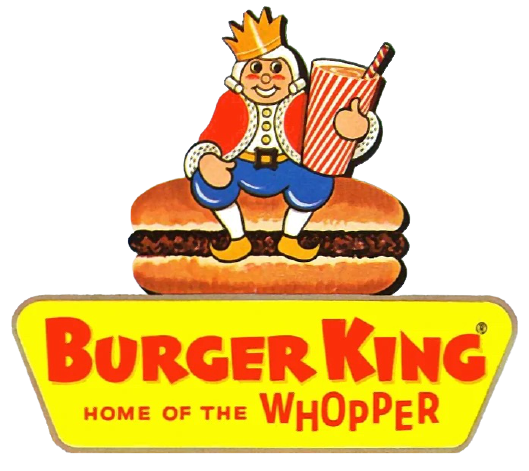
This Burger King logo from 1957 to 1969 is shown above and plainly shows what the company was selling, burgers and drinks. However the most recent logo is actually a lot more subtle about the burger reference. Today's version of this logo has hamburger buns holding together the text "Burger King." A site I found says that the logo "
demonstrates an alluring and vivacious image of a fast
food restaurant, which is ideal for the fast food culture amongst the
teenagers. The sparkling colors used in the logo are vibrant enough to draw
attention of the spectators."
- References - http://www.famouslogos.us/burger-king-logo/


This company's choice of logos didn't make any sense to me, neither present day nor past logos. The logo shown above is the first logo for Apple Computer Company. It was created back in 1976 and depicts Sir Issac Newton under the tree from which the apple fell. In extremely tiny text, you can barely make out a phrase, "Newton... A mind forever voyaging through strange seas of thought... alone." This logo was created by Ronald Wayne, the third co-founder of the Apple company. The logo below shows an apple with a bite out of it. The common rumor surrounding this logo's creation was because of a man named Alan Turing, who committed suicide with a cyanide-laced apple. When Rob Janoff was confronted about this being the true reason, he laughed and said "What a wonderful urban legend." According to him, the bite on the Apple logo was to really let people know that it was an apple and not a cherry. The bite also played along with the computer buffs at that time because it had a similar sound off to the word ‘byte’, a unit of digital information in computing and telecommunication.

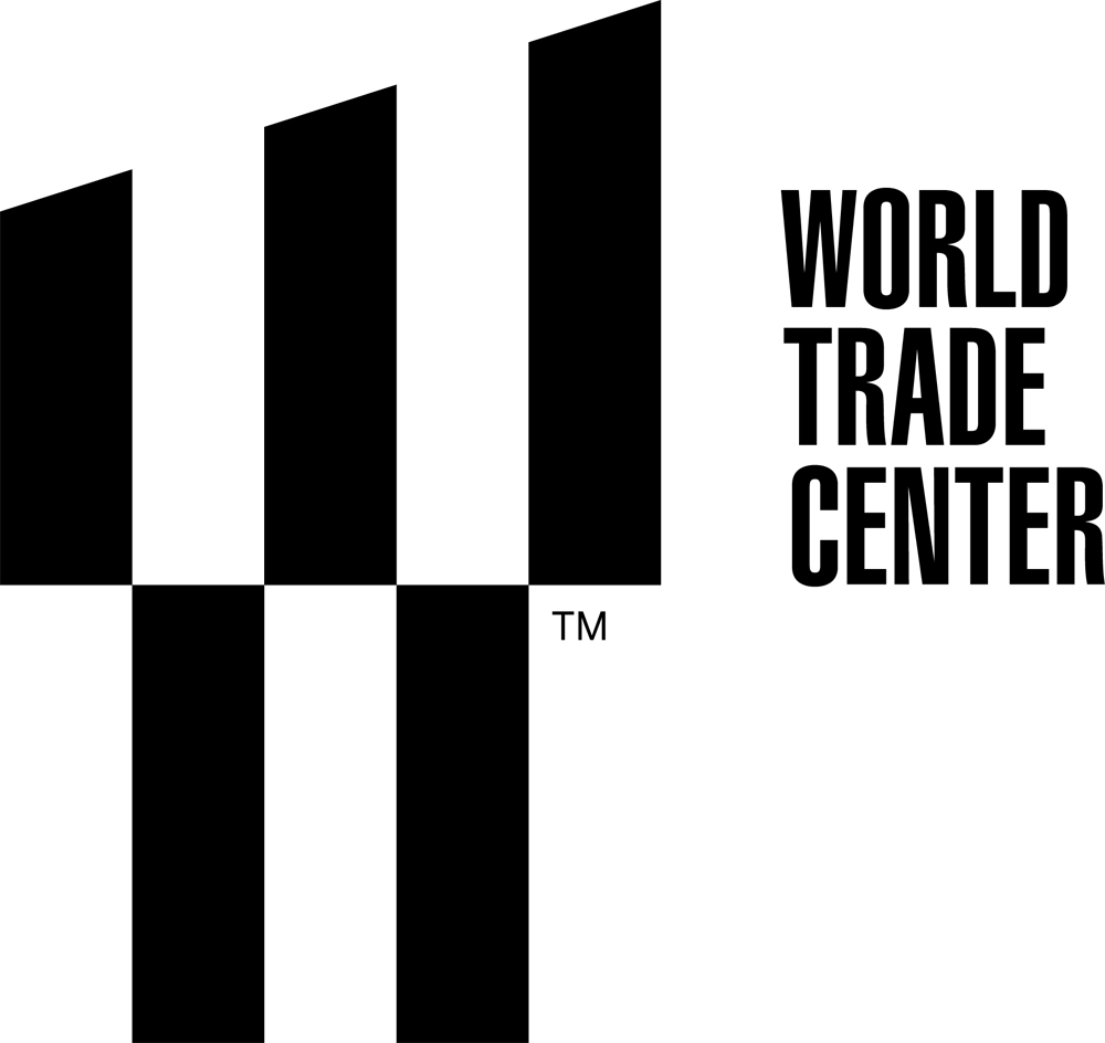
Here is my most tricky sign that I cannot understand fully. This is the logo for the World Trade Center and it is just a simple "W" right? WRONG! The "W" you see is supposed to represent the five towers that will be in the 16-acre lot in lower Manhattan of New York City. Wait, there is more to this logo than just representing the five towers. It also represents the twin towers which fell on 9/11. The three columns on the top half of the logo have two spaces which are supposed to represent the twin towers and their absence. and then finally all together it makes a "W" which stands for the World Trade Center or Westfield World Trade Center. Now I understand it after looking it up but I didn't even think of that all for the logo in the beginning.


I agree that burger king gets the message across really well but I did not no about WWF. So for me I didn't get the message from that. However all of the ones you chose are readable and ledgable in the sense of the discussion. Good choices.
ReplyDelete