
For this weeks blog post, I chose to change the font Arial.
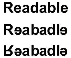
In the example below, I started off with the word readable typed in Arial font.
For the second portion, I chose every second letter and flipped it horizontally.
This makes it a little harder to read then the original text.
I then flipped the two beginning letters and last letter.
This is now a hard to read word.
I believe this can be a valid design tool in certain circumstances.
If the message your are trying to portray is lackadaisical, then this would work perfectly.
However, this style would only work for a small portion of designs.
Many people have enough trouble reading a sign while driving.
Readability is almost always important, to insure people are understanding the concept of the wording.


Arial? Really? Arial? Didn't we kill off Arial in Week 1? Here's your penalty reading: http://www.marksimonson.com/notebook/view/the-scourge-of-arial
ReplyDeleteAlso: centered text? We don't center-justify text unless we are trying intentionally to slow down the reading. Centered text is best left for poetry, wedding invitations, and simple design elements, like headlines and subheads. You will almost never use centered text for body copy; it's just very hard to read as the eye (and brain) has to hunt for the beginning of the line.
Besides what bill said about the centering of your poetry this was a perfect example with such subtle changes. The flip of the 3 letters made a huge difference.
ReplyDelete